
Work Itaú Private Bank App
02 · Scale
Three functions, one launch date.
The first proprietary app for the highest-income segment of Latin America’s largest bank.
- Role
- Product Manager for the launch
- Organization
- Itaú Private Bank
- Scope
- Business prioritization, Design System, development, launch
- Result
- +9% promoters in 10 weeks
01 Context
A segment with no product of its own.
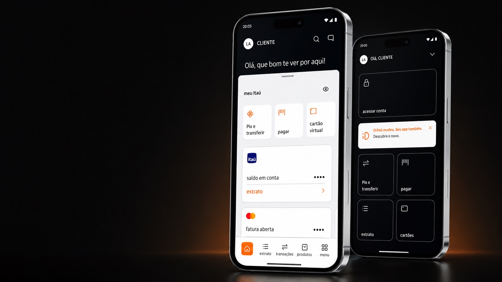
The highest-income segment of the largest bank in Latin America had no app of its own. Its clients used the retail product, on a relationship that was anything but retail.
In private banking the interface is rarely the relationship. Clients are served by people, over years. But the absence of a digital product still says something, every day, to a client who runs the rest of their life from a phone.
02 The launch
Orchestration against a fixed date.
I acted as Product Manager for the launch. The work was orchestration: business, design and technology pointed at a single customer experience, with a date that would not move.
Three things had to land together: features personalized for the segment, full adaptation to the bank’s new Design System, and the entire technology backlog delivered before launch. Product management here was mostly sequencing, and holding all three to the same clock.
Results
promoters in the first 10 weeks after launch
03 Personalized for the segment
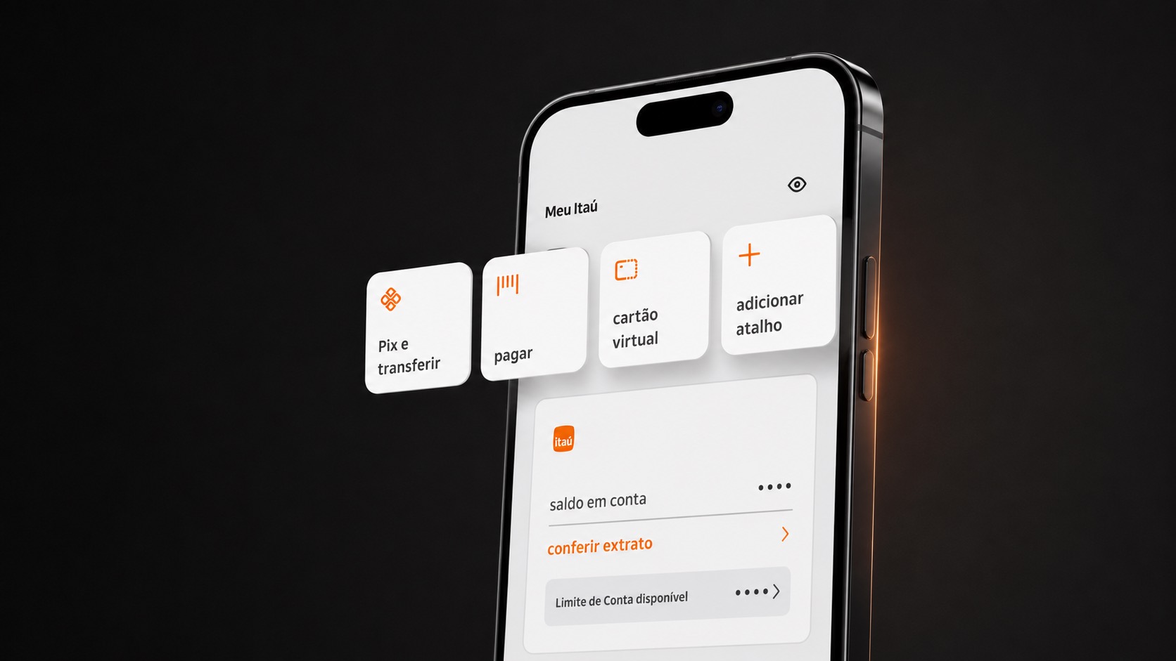
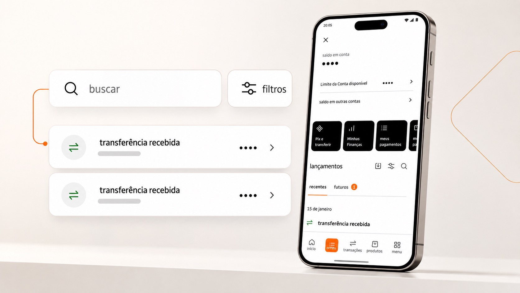
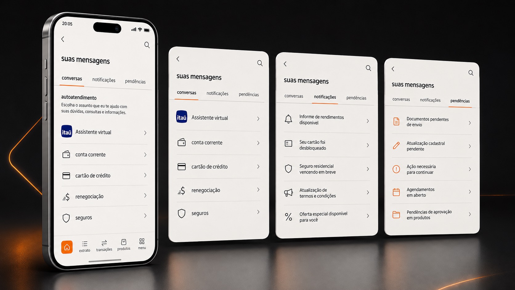
What “personalized for the segment” meant in practice.
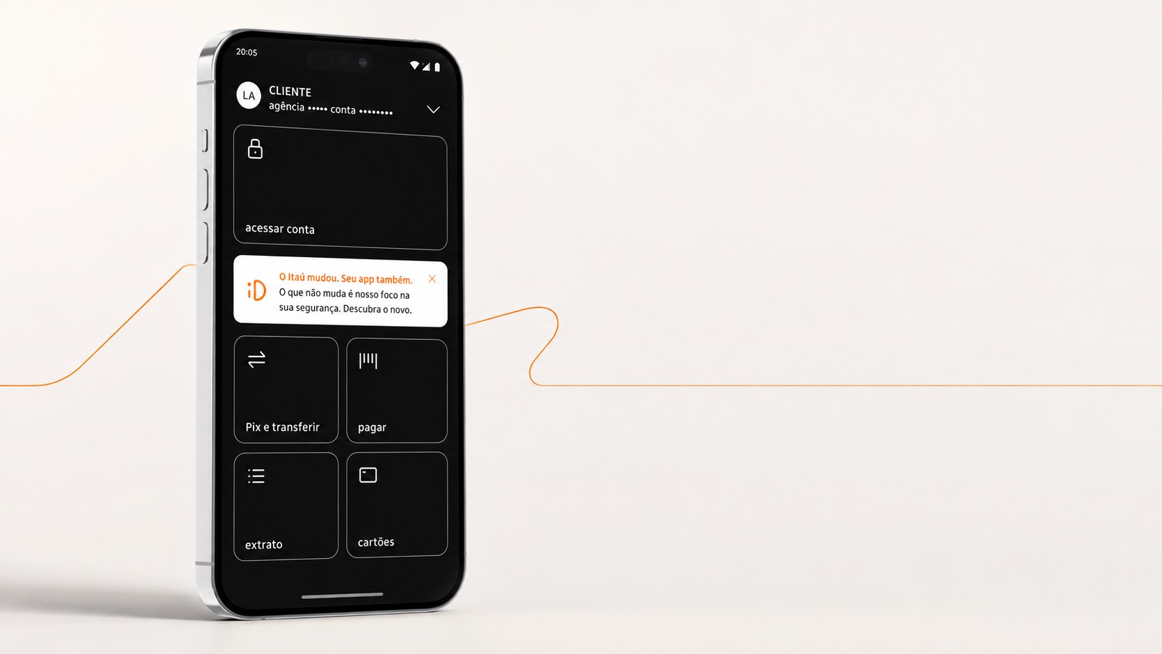
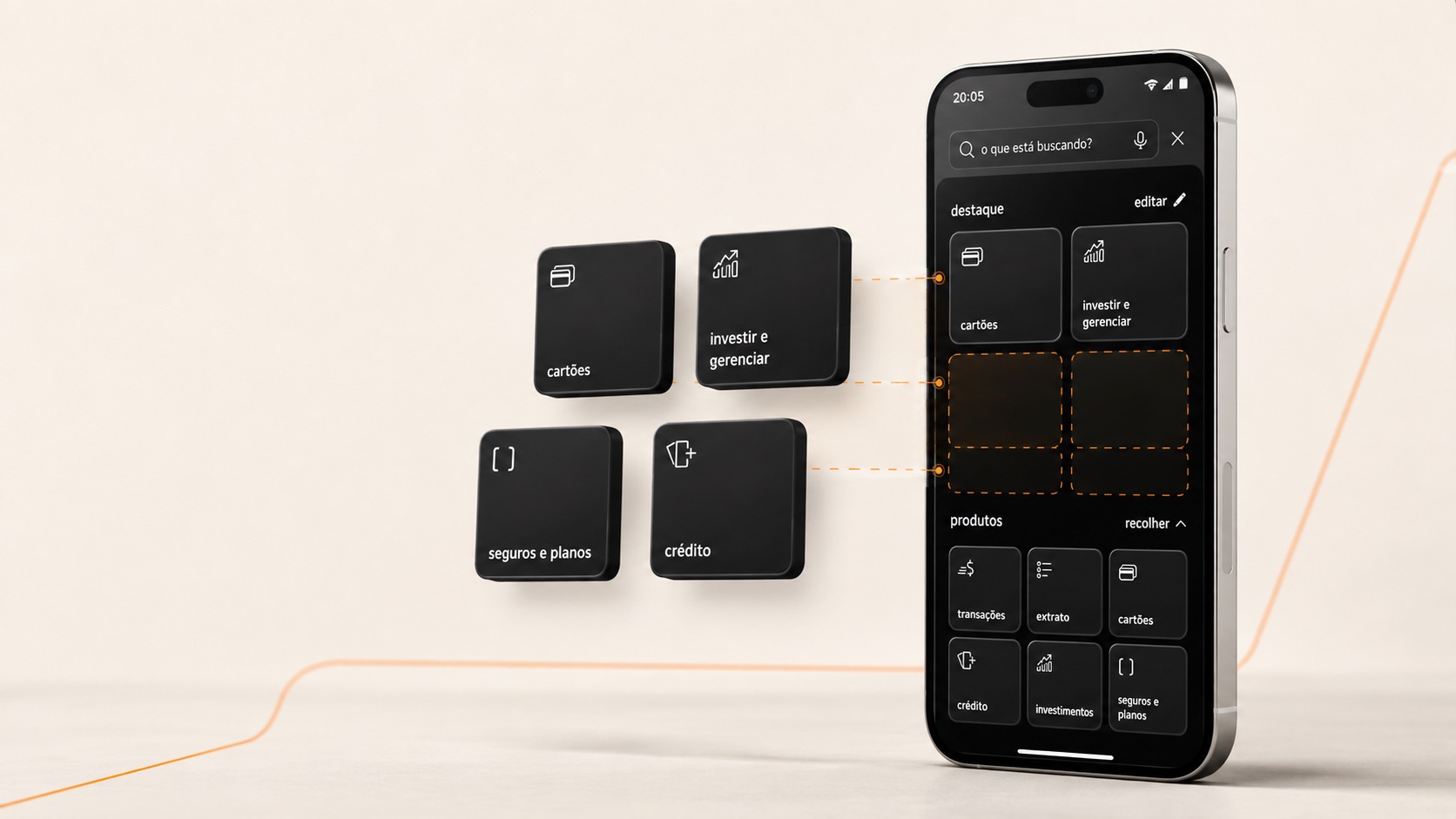
Not a skin. The decisions that mattered were about what a high-net-worth client should reach without asking, and what should stay one deliberate step away.
04 The bet
Adopting the Design System while building.
The bet that paid off later
A segment product is the easiest place in a bank to justify a bespoke interface, and the most expensive place to maintain one. Adopting the new Design System while we were still building is what kept the app cheap to change afterwards.
05 How I ran it
A date that would not move is a design constraint.
I was the Product Manager for this launch. On a launch with a fixed date, most of the work is deciding what gets cut. These are the calls that decided what did not.
-
I pointed three areas at one description of the experience
Business, design and technology worked against a single written description of what the client would get, instead of three parallel plans. Most launch failures at this scale are not build failures. They are three teams optimizing different definitions of done.
-
I took on the new Design System while we were still building
A segment product is the easiest place in a bank to justify a bespoke interface and the most expensive place to maintain one. Adopting the bank's new Design System during the build cost us time then and is the reason the app stayed cheap to change afterwards.
-
I framed personalization as reach, not as decoration
I asked the team a question with an answer: what should a Private client reach without having to ask for it, and what should stay one deliberate step away. That is a question about hierarchy. Asking instead what feels premium is a question nobody can settle.
-
I treated the technology backlog as the launch schedule
With the date fixed, the order in which we delivered the backlog was the real design of the launch. What ships first is an experience decision long before it is a delivery one.
The hard part was never the deadline. It was that the same product had to feel made for this segment and still behave like part of the bank, and those two pull in opposite directions on almost every screen.